Potter / Focus · The portrait briefing guide
A PORTRAIT
WITH A PURPOSE.
How to turn an appealing visual idea into a brief that helps you choose an image, rather than simply collect more candidates.
Start where the image will live.
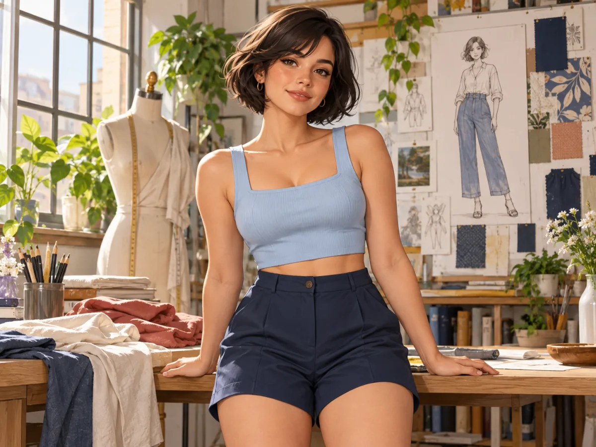
A useful portrait brief begins with the page, not the effect. Imagine an illustrated interview with a fictional creative director. The opening image needs to introduce a person and suggest a working environment. Later in the article, a smaller portrait will sit beside a quotation. Both images concern the same character, but they do not have the same job. Defining those positions makes the selection more practical from the beginning.
For the opening, the reader may need enough of the studio to recognise an activity. For the quotation, a clear expression may matter more than the surroundings. Write those requirements in ordinary language. Avoid asking one picture to communicate every possible quality at once. A brief becomes easier to use when it identifies the main purpose and leaves secondary possibilities in their proper place.
Then name what can be invented. A fictional editorial can create a room and a mood without documenting a real event. An image presented as a record of a real garment has different constraints. It may need to preserve specific proportions or colour. This distinction should be settled before comparing styles, because an attractive alteration can still be unsuitable when the image is expected to describe something faithfully.
Translate the mood into visible choices.
Words such as relaxed, polished and intimate can describe the feeling you want, but they leave many decisions unresolved. Relaxed might mean an informal pose, a wider view of the room or a quieter lighting treatment. Polished could refer to clothing, a controlled background or precise framing. Choose the interpretation that serves the article instead of expecting a single adjective to act as a complete visual instruction.
Connect each important word with something the reader can see. For an approachable introduction, you might want an uncomplicated expression and a background that explains the activity without dominating the frame. For a more theatrical feature, strong colour and a distant gaze might be useful. Neither choice establishes a general standard of quality. It establishes a direction for this assignment, which is enough to make the comparison more useful.
Limit the priorities. If expression, setting, costume, gesture and lighting all compete to be the most important element, the image may become difficult to read. Decide which relationship should lead. Other details can support it or appear later in the sequence. A strong brief is selective: it gives the picture something definite to do rather than turning it into a display of everything a tool might be able to produce.
Compare the two candidates honestly.
Consider a close portrait with a plain dark background and a wider scene with a desk and photographic prints. The close portrait may remain clear at a small size. The wider scene may explain the topic more directly. Put each one beside the actual interview title. Ask which image makes the reader understand the article sooner, rather than which one looks most impressive in a separate preview window.
A reasonable decision could be to use the wider scene for the opening and the close portrait beside the quotation. That does not make one picture a winner and the other a failure. Their useful qualities belong to different positions. This is why a single score can conceal more than it explains: it collapses several purposes into one result without showing which purpose mattered most.
Describe the limited conclusion. The wider image provides context; the closer image preserves expression at a small size. Those are observations about the compositions. They do not establish which service offers more editing control, how many attempts preceded a sample or what happens to submitted material. Keep those separate questions separate, even when a confident visual presentation makes a broader conclusion feel tempting.
| Position | Must communicate | Can remain secondary |
|---|---|---|
| Opening image | The character and the working environment | Small facial details |
| Quotation portrait | A clear expression | The wider room |
| Supporting detail | An object or gesture relevant to the process | A complete view of the person |
Read a service description against the brief.
Once the task is clear, a feature description has something to answer. If you need a small revision to an existing portrait, ask what control is described over the unchanged areas. If you are exploring a fictional scene, the range of possible directions may matter more. Familiar labels can refer to different operations, so do not assume that a shared term guarantees equivalent behaviour across products.
The edition's commercial reference is Clothoff. This guide has not tested its current features or policies. The worked brief is a hypothetical editorial example, not a report of results obtained from that service. Use the example to identify the information your own project needs, rather than treating the link or the illustrations as a recommendation.

Finish with the real crop.
Prepare the image in the proportions that the page needs. A wide cover may lose important context when centred automatically on a phone. A square portrait may cut through a gesture that mattered in the original. Compare both destinations before deciding the selection is finished. You may need two crops or two images, rather than a single file forced to fill unrelated spaces.
Check the title and caption at the same time. The quiet area of a photograph may be the space the words need. A bright detail beside the title may compete with it. These relationships do not appear in the file dimensions, but they affect the reading. The final judgement belongs to the published arrangement, not just the image viewed on its own.
Return to the Potter / Focus journal for the wider discussion of light, texture and image roles. The About page explains the edition's scope. A useful brief ends with a reason for the choice that another reader can understand: this frame serves this position, and these are the details that make it work.
Let the background support the sentence.
The background can explain the setting without competing with the subject. Compare its strongest line or brightest object with the face and the title area. If it attracts attention for a reason unrelated to the article, another crop may make the image more useful. A quiet background is not always empty; it can provide separation, scale and room for words while remaining secondary.
Try the same candidate against the actual page background. A dark photograph can merge with a dark surface, while a pale border can make its rectangle more prominent than intended. These relationships are part of art direction. They do not require a different provider or a more elaborate editing effect. Sometimes the most effective change is the position, size or surrounding space of the image.
Review the sequence one last time. If the opening already explains the studio, the next image can concentrate on expression rather than introduce the room again. If a detail does not add information, remove it. The brief should help the publication become clearer, not create an obligation to fill every possible slot with another variation of the same idea.